27 Restaurant Menu Design Ideas That Sell More (With Examples)
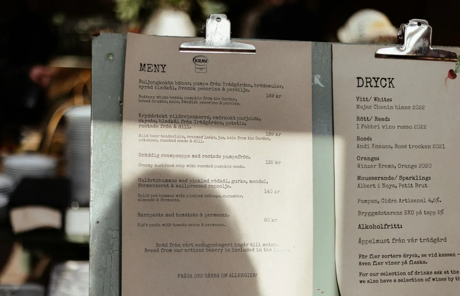
Good menu design makes the next decision easy. The best ideas are simple: group items into clear sections, keep type readable, price without clutter, describe dishes with specific words, and use photos on only a few items. This guide lists 27 restaurant menu design ideas for print and QR menus. Each one says what to do, why, and how strong the evidence is.
Some popular menu design "rules" have weak proof behind them. Where research exists, we link it. Where it is only practitioner advice, we say so.
Key Takeaways
- Guests read menus in order, like a page of text. A peer-reviewed eye-tracking study found no reliable "golden triangle" sweet spot, so design for clear reading order first.
- Clean price formatting helps. A Cornell study found diners spent about 8% more on menus with plain numbers than on menus with dollar signs. It was one venue, so treat it as a strong hint, not a law.
- Specific names beat generic ones. A Stanford field study found indulgent, specific labels increased how many diners chose vegetables by 25% compared with basic labels.
- Readable beats pretty. Meet a 4.5:1 text contrast ratio and never rely on color alone to carry meaning.
- A QR menu is a mobile screen first. Design it for one thumb, one column and fast edits.
Table of Contents
- 1. Give the menu one job
- 2. Build clear sections
- 3. Design for reading order, not the golden triangle
- 4. Put your best sellers first in each section
- 5. Use white space on purpose
- 6. Cut the item count
- 7. Highlight only a few items
- 8. Use two fonts, not five
- 9. Set a minimum text size
- 10. Build a clear type hierarchy
- 11. Avoid all caps and script for descriptions
- 12. Try proven menu font pairings
- 13. Limit the palette to three colors
- 14. Check text contrast
- 15. Never use color alone to carry meaning
- 16. Use photos on selected items
- 17. Keep one photo style
- 18. Drop currency signs
- 19. Do not line prices up in a column
- 20. Use an anchor item with care
- 21. Write specific dish names
- 22. Write short, concrete descriptions
- 23. Show allergens and dietary tags clearly
- 24. Design the QR menu mobile first
- 25. Make edits fast
- 26. Add languages for your real guests
- 27. Test on real phones and real guests
Planning a high-end room? Read our companion guide on luxury restaurant menu design. This list covers the basics every restaurant, cafe or bar can use.
1. Give the menu one job
Layout. A menu helps a guest choose quickly and feel good about the choice. Decide what yours must do before you touch a font.
A fast cafe menu needs to be scannable in 20 seconds. A tasting-menu room can tell a story. Write the job in one sentence and check every design choice against it.
Evidence: practitioner advice. No study needed, but it prevents most bad menus.
2. Build clear sections
Layout. Group dishes the way guests think: starters, mains, sides, desserts, drinks. Use clear headings and keep each section visually separate.
Name sections in plain words. "From the Grill" is fine. "Our Journey" tells a guest nothing. Many restaurants find 5 to 7 sections easy to scan, but that is a rule of thumb, not research.
3. Design for reading order, not the golden triangle
Layout. The "golden triangle" idea says guests look at the middle, then the top right, then the top left of a menu. Many menu design articles repeat it as fact.
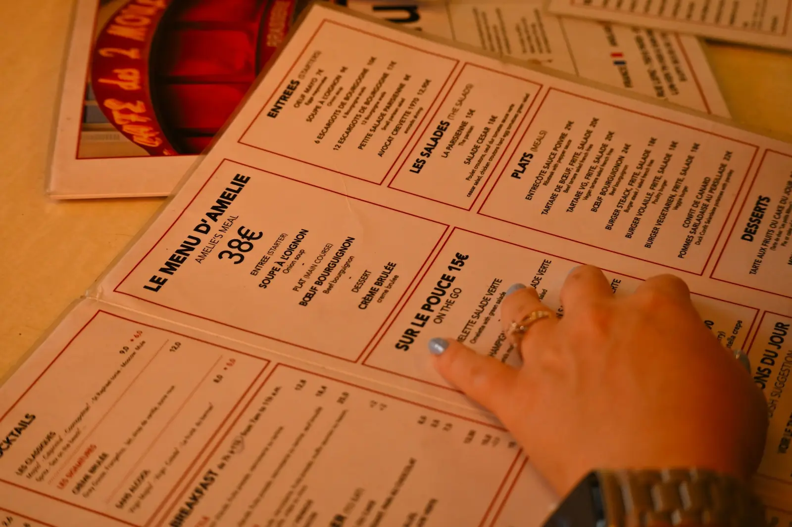
The evidence is thin. A 2012 study by Sybil Yang in the International Journal of Hospitality Management used eye trackers on a mock two-page menu. It found no evidence of menu sweet spots, where diners look longest. Readers went through the menu largely in order, like a book. The study did find "sour spots," where readers spent the least time.
Practical result: make the reading order obvious. Put sections in the order of a meal and keep one clear path down the page.
4. Put your best sellers first in each section
Layout. If guests read in order, the first line of each section gets read first. Lead with dishes you want to sell, such as high-margin items you are proud of.
This is our reading of the sequential-reading finding in idea 3. It is a sensible inference, not a tested rule. Check your own sales mix before and after you move items.
5. Use white space on purpose
Layout. Empty space is not wasted space. It separates sections, rests the eye and makes the dishes you highlight stand out.
If a print menu feels crowded, remove items before you shrink the type. On a phone, add vertical spacing between items so thumbs do not tap the wrong one.
6. Cut the item count
Layout. Long menus slow decisions and make the kitchen harder to run. Cut dishes that sell rarely, repeat the same ingredients or need special prep.
We found no solid research on an ideal number of items, so we will not invent one. Use your sales report: items that rarely sell are the first to go.
7. Highlight only a few items
Layout. A box, icon or "chef's pick" tag draws attention. Use it on two or three items per menu. If everything is highlighted, nothing is.
Pick items by margin and popularity, not by habit. Our guide to design best practices for high-converting digital menus covers highlight tags on screens.
8. Use two fonts, not five
Typography. Menu fonts do two jobs. They set the mood and they must be easy to read. One font for headings and one for body text is enough.
Pick one distinct display font for section titles. Pair it with a plain, highly legible font for dishes and descriptions. A third font, such as script for a logo, is the limit.
9. Set a minimum text size
Typography. Dim rooms, older guests and phone screens all punish small type.
- Print: test the menu under your real lighting, at table distance. Practitioners often start descriptions around 10 to 12 pt and go up for dim rooms. Treat that as a starting point.
- Screen: use at least 16 px for descriptions. Smaller text is hard to read on a phone in a dark bar.
10. Build a clear type hierarchy
Typography. A guest should see three levels in one glance: section title, dish name, description. Use size and weight, not extra fonts, to separate them.
| Element | Suggested treatment |
|---|---|
| Section title | Largest, display font |
| Dish name | Bold or semi-bold body font |
| Description | Regular weight, slightly smaller |
| Price | Same size as the name, regular weight |
11. Avoid all caps and script for descriptions
Typography. Long lines in all capitals are slow to read. Decorative script fonts are hard to read at small sizes.
Use caps only for short section titles. Use script only for one or two decorative words. Write descriptions in sentence case.
12. Try proven menu font pairings
Typography. If you search for "menu fonts," you will see long lists of decorative fonts. A safer approach is a pairing of one serif and one sans-serif.
- Classic: Playfair Display for titles with a clean sans such as Inter for text.
- Warm: Lora for titles with Open Sans for text.
- Modern: a geometric sans such as Montserrat for titles with the same family in a lighter weight for text.
All of these are free in Google Fonts, but check the license before you print a commercial menu. Always print one test page before the full run.
13. Limit the palette to three colors
Color. Use one dark color for text, one light background and one accent. Take the accent from your logo or interior so the menu feels like part of the room.
Use the accent for section titles and highlight tags only. Colored body text is rarely worth the loss of contrast.
14. Check text contrast
Color. Light gray text on white looks elegant and reads badly. The web accessibility standard WCAG 2.1 asks for a contrast ratio of at least 4.5:1 for normal text, and 3:1 for large text (success criterion 1.4.3, level AA).
Paste your text and background colors into any free contrast checker. Do this for both screen and print designs. Text on photos needs an overlay or a solid panel behind it.
15. Never use color alone to carry meaning
Color. A green dot for vegetarian and a red dot for spicy fails for guests with color blindness. WCAG success criterion 1.4.1 says color should not be the only visual means of conveying information.
Pair every colored mark with a letter or a word, such as "V" or "Vegan." Add a short legend at the bottom of the page. For more on accessible menus, see our accessible QR menu guide.
16. Use photos on selected items
Photos. Photos help when a dish is hard to picture from its name. They help less when the name is already clear.
A study by Hou, Yang and Sun in the International Journal of Hospitality Management (2017) found that for descriptive food names, pictures improved attitudes, willingness to pay and purchase intentions. For ambiguous names, pictures helped only some people. So use photos on unfamiliar dishes, signature items and desserts. Skip them on a plain side of fries.
Be careful with sales claims such as "photos raise sales by 30%." We did not find an independent study behind these numbers, so we do not quote them.
17. Keep one photo style
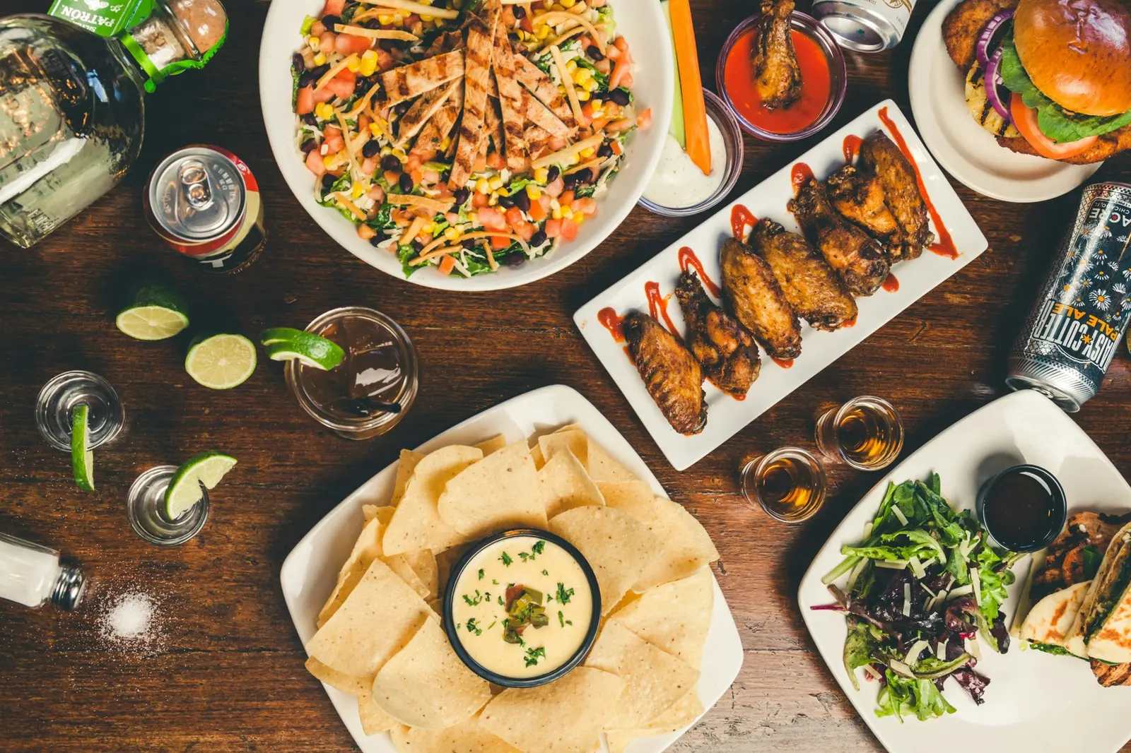
Photos. Mixed lighting, plates and angles make a menu look cheap, even when the food is good. Shoot all photos in one session, from the same angle, on the same table.
Natural window light and a simple surface work well. If a dish cannot be photographed well, leave it without a photo. A fine-dining room may choose no photos at all, and that is a valid design choice.
18. Drop currency signs
Pricing. Write "14" instead of "$14.00". This is the best-known menu pricing study. In 2009, Yang, Kimes and Sessarego tested three price formats on 201 diners at a Culinary Institute of America cafe. Cornell reported that diners "spent an average of $5.55 -- about 8 percent -- more when the menu did not use dollar signs." Prices written out in words did no better than prices with signs.
Honest limits: the study covered one venue and one set of menus. Test it. It costs nothing to remove a symbol.
19. Do not line prices up in a column
Pricing. A neat column of prices on the right makes guests scan for the lowest number. Place the price right after the description, in the same type as the text.
Evidence: practitioner advice. We did not find a peer-reviewed test of this layout, so treat it as an idea to test on your own sales data.
20. Use an anchor item with care
Pricing. A decoy or anchor is a high-priced item that makes the dish next to it look reasonable. A "market price" lobster next to a mid-range steak is the classic case.
The evidence is mixed. A University of Westminster online trial tested price-based decoys as a way to nudge diners toward sustainable dish choices. It found no main effect on choosing the target dish, and the choices were hypothetical. Use an anchor only if the premium dish is a real product you would be proud to sell.
21. Write specific dish names
Copy. "Chicken sandwich" tells a guest little. "Buttermilk fried chicken sandwich" tells a story and sets expectations.
A Stanford field study in a campus cafeteria ran for 46 days. As reported by FoodNavigator, indulgent labels such as "rich buttery roasted sweet corn" drew 25% more diners to the vegetables than basic labels. The study is Turnwald, Boles and Crum (2017), "Association Between Indulgent Descriptions and Vegetable Consumption" in JAMA Internal Medicine.
You may see a "27% sales lift" quoted for descriptive labels. That figure comes from a 2001 study that has been questioned, so we left it out.
22. Write short, concrete descriptions
Copy. Name the main ingredients, the cooking method and the origin if it matters. Keep to one or two lines. Drop empty words such as "delicious" and "amazing."
| Before | After |
|---|---|
| Delicious chicken pasta | Rigatoni, roast chicken thigh, lemon, parmesan, black pepper |
| Chocolate dessert | Warm dark chocolate fondant, vanilla ice cream, sea salt |
| House salad | Little gem, shaved fennel, pickled radish, mustard dressing |
Do not describe a dish with a claim you cannot support. "Locally sourced" and "organic" are claims, so use them only when true.
23. Show allergens and dietary tags clearly
Copy. Guests with allergies read menus more carefully than anyone. Make the allergen information easy to find and easy to understand.
In the EU, Regulation (EU) No 1169/2011 lists 14 allergens that must be declared for food sold unpacked. See our guide to the 14 EU allergens on restaurant menus. In the US, the FDA lists nine major food allergens, including sesame since January 1, 2023 for packaged foods.
Use short text labels or standard icons with a legend. Your business enters the allergen data and stays responsible for it. In QR Menu Generator, allergen tags and the diner allergen filter are on Pro. This guide is not legal advice.
24. Design the QR menu mobile first
Digital. Most guests open a QR menu on a phone, in one hand, often in a dim room. Design for that first.
- One column, no pinch-and-zoom.
- A category bar that stays visible while scrolling.
- Large tap areas with spacing between items.
- Fast-loading images, sized for phones.
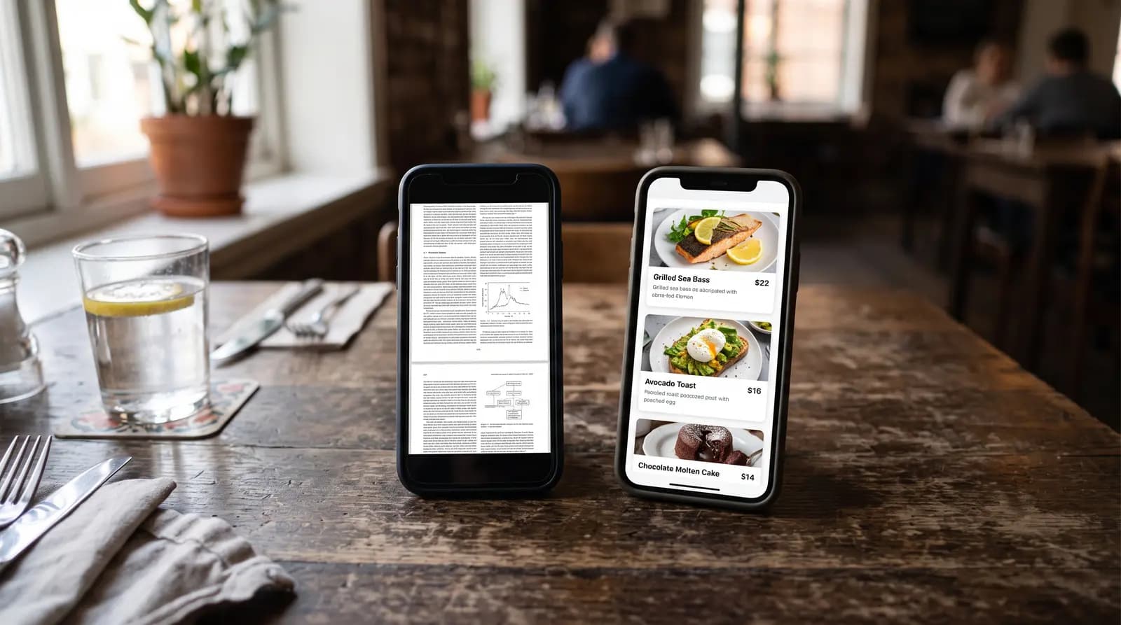
- Text, not a PDF. A PDF forces zooming and cannot be searched easily.
Our comparison of QR menus and PDF menus explains the difference in detail.
25. Make edits fast
Digital. A good menu design is one you keep accurate. A beautiful menu with last month's prices is a bad menu.
With a digital menu, a price or ingredient change is a short edit, not a reprint. QR Menu Generator updates changes instantly, so your printed table codes never go stale. Mark sold-out items the moment they sell out.
26. Add languages for your real guests
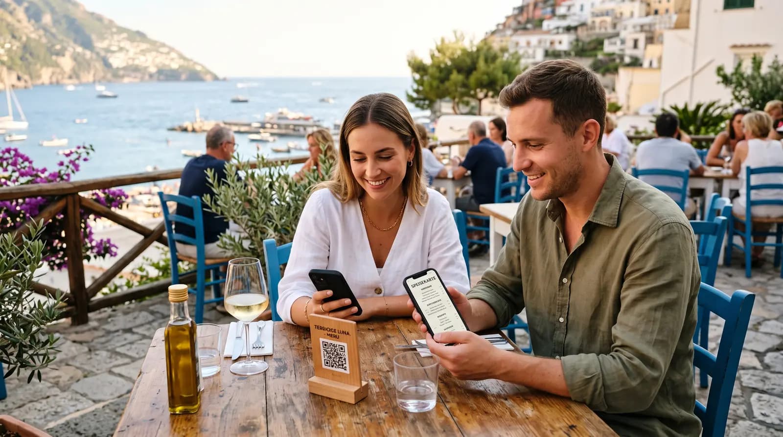
Digital. Translate the menu into the languages your guests actually speak. Look at who sits at your tables, not at a language list.
AI translation in QR Menu Generator (on Pro) gives you a first draft in each language. Have a native speaker check dish names and allergen words. See our guide to multilingual QR menu apps.
27. Test on real phones and real guests
Digital. Open the menu on an old phone, on a new phone and in bright sunlight. Ask three guests to find a vegetarian main course and a drink. Watch where they hesitate.
Then fix the first thing that slows them down. Repeat monthly. A good menu is never finished. You can look at a live example in the QR Menu Generator demo.
Put these ideas into a live menu
QR Menu Generator has 8 menu themes, product photos and custom QR design. Allergen tags, the diner allergen filter and AI translation are on Pro. You can start on the free plan (1 restaurant, 5 categories, 20 products) and upgrade when you need them. Used by 500+ restaurants. Create your menu free or see the pricing page.
Cover photo by Annie Spratt on Unsplash.
Frequently Asked Questions
- What makes a good restaurant menu design?
- A good menu design is easy to read, easy to scan and honest about the food. It uses clear sections, readable type, sufficient text contrast, simple price formatting and specific dish descriptions. Photos and highlights are used on only a few items.
- Is the golden triangle real?
- The evidence does not support it. A 2012 eye-tracking study in the International Journal of Hospitality Management found no sweet spots, and readers moved through the menu in order. Design for a clear reading order instead.
- Should I remove dollar signs from my menu?
- You can test it. A 2009 Cornell study found diners spent about 8% more on menus without dollar signs. It covered one venue, so compare your own sales for a few weeks before you commit.
- How many fonts should a menu use?
- Two is enough: one for titles and one for dishes and descriptions. A third font is acceptable for a logo or a decorative word. More fonts make a menu look messy.
- Do menu photos increase sales?
- Research suggests photos help most with descriptive or unfamiliar dishes. We found no independent study that proves a specific sales percentage, so test photos on a few items and compare results.
- How do I design a menu for QR codes?
- Design for a phone first: one column, large tap areas, a sticky category bar and fast images. Use real text instead of a PDF. Keep the menu easy to edit so prices and availability stay accurate.
About the author
Evrenus Fırat Polat
Restaurant technology expert and founder of QR Menu Generator. Passionate about helping restaurant owners harness digital tools to grow their business.